SOMEWHERE A BIT FURTHER AWAY
FOOTHILLS OF THE APPALACHIAS
NORTH CAROLINA, SOUTHEAST UNITED STATES
essay by Helena Sanders – 12 dec. 2022topic: Bodies and Breath: Embodied Research & Writing
February 2, 2014
3:00 PM
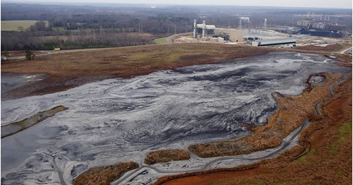
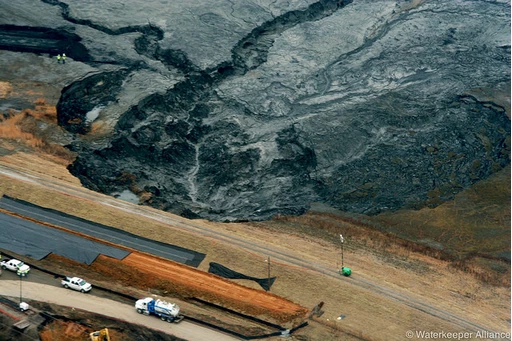
82,000 tons of coal ash and 27 million gallons of liquefied ash pond water waste burst through the walls of its containment pit and spill into the Dan River, at the point where it runs through Eden, North Carolina.1)
The Duke Energy Company and its Eden power plant operations are named the responsible party. Soon after the initial spill, scientists test the waters of the Dan to determine the extent of the damage. For those unfamiliar, coal ash slurry is a by-product of coal burnt in coal-fired electrical power plants, and contains heavy metals like mercury, cadmium and arsenic.2) While some of this waste can be recycled, the most common afterlife for the toxic soup is to be placed in containment basins dug directly into the ground. In Eden, a clean-up plan was slow to form and consisted primarily of letting time do its work and allow the heavy metals to sink to the river floor. Duke Energy gave a formal apology and a few million dollars to dredge 8% of the spill. Content with this solution even as bloated fish and grey sickly scum floated on the surface of the water, scientists and Duke Energy officials shook hands with the North Carolina Governor Pat McCrory - himself a former employee of Duke Energy Corporation for three decades - and declared to the residents of Eden that the water safe enough for drinking and most recreation.3)
“This kind of thing is not unusual,” said neighbours to the north across the border in West Virginia, as they light their own contaminated tap water on fire for YouTube videos”. 4)
Duke Energy Corporation - one of the biggest electric power holding companies in America - is right in our backyard. The same Duke as in Duke University, their mascot - the Blue Devils, the blue of a gas flame dancing from a stove. The same Duke family whose company subsidiaries ordered armed thugs across state lines into Harlan County, Kentucky to shoot at striking miners and their families at Brookside Mine in 1973.5) Dukes of a new world feudal system, making sure deep black coal continues to come to the surface, for energy, for wealth, for medicine - but also - for a rainbow of dyes.
When we look out into a field, muddied and swamped with coal ash slurry in the dead of winter, the first thing we are struck with is a seeming absence of colour. What was green is now flooded with lifeless greys, rancid-butter beiges and cold blue-black. Is there a way back from burnt coal?
When scientists tested the water of the Dan River, they found unsafe levels of:
Lead
[ Lead White: First introduced as a paint by the Ancient Greeks. Used in much of early classical European oil painting, and extensively marketed as a modern interior and exterior house painting and some cosmetics until it was banned from residential use in 1978 in the United States due to extensive reports of poisonings and stunted mental and physical development in children cause by exposure to paint dust. ]
Arsenic
[ Scheele’s Green: A much-coveted bright green pigment invented by Carl Wilhelm Scheele in 1775. This toxic copper arsenide was used for wall paper printing and cloth dyeing. Notorious for its suspected role in the death of Napoleon while he was in exile on the island of St. Helena. It was his favourite colour; each room of his house was painted in the noxious shade. ]
Mercury
[ Vermillion Red: The pigment used in illuminated manuscripts to represent alchemical transformation. From cinnabar ore comes this warm brilliant red and also silver mercury - mercury sulphide - and is deadly to mine. It has long been used as a ceremonial colour, dusting the skeleton and tomb of the Red Queen in Chiapas, to the face of Jupiter in Rome. ]
Selenium
[ Orange Cadmium: Selenium rather than sulphur is added to some traditional cadmium compounds to create an orangish-yellow colour. It has good heat stability, and is often used in enamels, and in the red colour-glass of traffic lights. ]
Zinc
[ Zinc White: A popular alternative to lead white, introduced by Windsor & Newton paint company in 1834 as “Chinese White.” Zinc oxide is used frequently in ointments, dental cements, baby powder and sunscreen for its UV-blocking and anti-bacterial properties. ]
Where does colour go? If we trace the use of colour “in-hand,” as pigment, mineral, as a liquid medium, as a subject rather than referent, and follow its introduction into global economies, into our homes, into aesthetic hierarchies, feel with our senses where colour as light waves hold heat, we might begin to map a vast territory of relationships between the world and our selves, with the hope of extending the possibilities for communication beyond symbolic language, to attune to what might lie at the peripheries of our understanding.
These past years, I began keeping a collection of histories and folklore from sites where pigment - colour “in the hand”, touchable, transferable - is extracted and excavated. I am interested in what is going on in the landscapes where pigments are discovered, grown, collected and processed just before they spill out into the world, and what possesses us to put such energy and intervention into the creation of colours - made out of desire and accident as much as necessity. These are sites such as mines, chemistry labs, industrial waste sites, and nopal cactus farms where cochineal insects are harvested for red dyes. I have a soft spot for leaky sites where colour slips the leash of cultural and symbolic meaning.
Maybe a bit of terminology is helpful here. Generally speaking, a pigment is a coloured powdered material, insoluble in water, that reflects and absorbs light along a specific wavelength giving its uniform colour appearance. With the additive of a binder (literally, a medium which binds or adheres the pigment to a surface) such as oil, gum arabic, egg white, acrylic medium, etc, the pigment is now a paint and can be applied to various surfaces. A dye is a similar kind of colourant, the difference being that it chemically bonds to a surface (substrate) rather than sitting on top like a paint. In this text, I will be a bit more liberal and use the term pigment for both types of colourants.
For further example, organic Ultramarine is a blue pigment made from grinding the stone lapis lazuli into a powder, then filtering out impurities and other mineral contaminates. Synthetic ultramarine pigment can be created by mimicking the structure of the lapis lazuli at the molecular level. When oil is added, we have a tube of ultramarine colour paint at the art supply store. These pigments and paints appear blue because they absorb visible wavelengths of light but reflect back light in the particular part of the light spectrum. Pigments are used to colour or tint any variety of materials from plastics, ink, makeup, paint… Paint making is chemistry rather than guesswork; colours can be standardized or trademarked, and colours have long been named after the parts of the Earth from which they came (burnt Sienna, Egyptian blue).
_ _ _ _ _ _ _ _ _ _ _ _ _ _ _ _ _ _ _ _
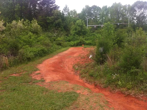
The oldest pigments we know of are of the ochre family. As close to common as dirt itself, ochre is found almost everywhere on the planet. Humans were using red ochre whenever it was present in the natural environment, concurrently and almost universally, with the exception of Antarctica. It was dug from the ground and applied as a colourant to decorate skin, hair, animals, the walls of caves, and the dead.
Ochre is a soft, earth pigment consisting mostly of iron oxide and manganese oxides. It can be found in a range of hues from rich rusty reds, cool purples, warm yellows, oranges, pinks, blues, and deep browns. Ochre is frequently contained in hematite ore, and needs little coaxing and minimal physical effort to be loosened from the ground. We see evidence of it in our landscapes, in the heavy wet clays of river banks which dye the water red-orange like a soup, or in the dusty dry orange and yellow hills around Roussillon en Provence in southern France. When it comes to ochre, the earth can barely contain itself.
…Color comes across [ as more a presence than a sign, more a force than a code…What is more, the idea of a color code is inappropriate, a brutal gesture towards containment. Far from being symbols, distinct from their referents, the colors are those referents in a deeply organic sense and that is why they are thought of in reference to God no less than to the copulating, procreating, growing, and dying human body. As [Victor] Turner says after his survey of research by anthropologists on color in several other non-Western societies, including India, a human physiological component is rarely absent from the contexts in which color is used in ritual. What he means is that color is fundamentally involved in the making of culture from the human body.10)
The need for colour permeates. It is incredibly difficult to tease apart the symbolic, magical, and aesthetic applications of the colour from practical ones as well. In a very literal turn, red ochre has confirmed antimicrobial and UV-blocking properties, and so we have seen it used historically on skin and hair for sun protection, and to dress wounds. Bearded vultures, a type of carrion bird, preen their feathers in pools of muddy ochre clay, staining themselves red to prevent the stench and bacteria of dead animals on which they feed from infecting them. Our Palaeolithic forbearers did the same; painting the bodies of their dead or a new born child in red ochre. The colour served a dual purpose - preventing bacterial infection while at the same time signalling to the Other World of death and creation the departure or arrival of one of our own.
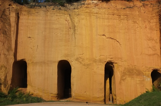
What couldn’t be found on the surface needed to be mined, since quality and variety of shades of ochre was and still is highly valued. An incision into the earth, an architectural doubling of the cave, the mine is a site of speculation, superstition and reward, and red in its variety of shades has long been one of the most sought-after decorative and commercial pigments. Red ochre was first painted onto vessels to increase their appeal for trade and exchange some 12,000 years ago
as humans began settling into more permanent, agriculture-based communities. Colour is tricky; it exists simultaneously in overlapping registers of meaning and economy. Colour is constantly in a state of referring to the symbolic, even as it escapes capture. It is nearly impossible to speak of or through colour without treading into the abstract.
_ _ _ _ _ _ _ _ _ _ _ _ _ _ _ _ _ _ _ _
Within a cosmovision that inextricably linked the supernatural, natural, and human realms, colors were grounded in their mineral, animal, and vegetative sources; they functioned metonymically as embodiments of the physical world; and they transcended their materiality to assume larger conceptual and symbolic valences...
…Nahuas had not one, but two color nomenclatures: one descriptive and the other metaphoric and symbolic,’ wherein descriptive names denote colors associated with particular objects (for example, chilichiltic, from chili, means ‘chili-red’) while metaphoric names connote objects, entities, and ideas through reference to color. The abstract qualities of metaphor allow for the invocation of colors as signifiers in various forms of indirect speech, including puns, divination, and medicine. As descriptive, metaphoric, and symbolic meanings compound, color words take on a multitude of meanings in precontact and colonial Nahuatl.11)
For the Nahua, inks and paints were sometimes made from the juice of flowers and emitted a fragrance, “Since Nahua writing was largely pictorial and was recited and performed, words took shape as painted images and, conversely, pictures could be read out loud as a spoken or sung language…The image-texts operated in several sensory modalities; whether spoken, sung, or painted, words provoked hearing, smell, and touch as well as sight.”12) Even though the aim of this language system was to differentiate from foreigners and foreign languages, I find it serendipitous that the name Nahua comes from the Nahuatl word for “audible, intelligible, clear.”
The complexity and continual referencing between the physical world, the divine, the quotidian and natural phenomenon that is allowed to occur when words are made in colour, smell, dance, and even taste, is striking. I imagine such a way of using colour and language shapes a way of physically moving through the world, as much as it describes it. In a quick n’ dirty juxtaposition of Nahua colour-speech with modern European language and thought, we see in the West a pedagogical disentangling of the divine from the daily and a philosophical and religious tendency to create a hierarchy of the senses; to separate and compartmentalize modes of experience rather than drawing freely from all. This is especially evidenced in the arts. Researcher and theorist Martin Jay notes at the beginning of his essay, Chromophilia:
The age-old battle in painting between disegno e colore (drawing and color), first explicitly articulated in the sixteenth century by Giorgio Vasari and periodically fought between artists like Michelangelo and Titian or Nicolas Poussin and Peter Paul Rubens, was more frequently won by the former. Deemed inferior to form because of its volatility and evanescence, color struggled to defend its honor against the advocates of order, solidity, and duration. Against the purity and calm of whiteness, the prismatic dispersal of color often seemed dangerously unstable, somehow akin to the desire unleasehed when men fell from grace.
Here are the less tangible properties of colour succumbing to a Western sense of morality? The word which comes up most often in texts on the subject to describe the volatility and evanescence of colour is “deceitful.” Deceit is a strong word. It implies that the misrepresentation is intentional and artful; it undermines the character of colour. This suspicion of colour and its incontinences has filtered on down. Speaking as much from first-hand encounters with the Western art historical tradition in art education at academies in the United Sates and Europe, “colour studies” are generally relegated to a semester foundational course at most. These often involve a few weeks of painting colour charts and monochromatic still-lives in gouache, and a brief mention of Josef Albers. But as any physicist, chemist, film maker or poet could tell you, colour painted on paper is not the same kind of colour as colour projected in light, or the colour of crushed cochineal insects daubed on fleshy lips. The implications of these differences are crucial. What pedagogies were introduced, that students are not taught to recite songs in colour, or paint letters of the alphabet which emit fragrance?
Like the habits of nuns and the sombre uniforms of judges, lawyers, and pith-helmeted ethnographers, colour in the West is often kept from exploding into the garish particularly to demonstrate moral and political hierarchies. But English terminology around colour and design often betrays a deeper historical racism masked as “taste”; a disdain for colour “out of bounds”. Chintz is the name of one type of highly-pattered, bright-hued cloth, cheaply produced in Europe and exported - along with many other similar textiles - by colonial Britain, the Netherlands and Belgium to colonial holdings in Africa. These textiles were often exchanged for metals mined in the Belgian-held Congo, but also in exchange for human bodies, for enslaved people. At the end of the 1890s, the term chintzy entered the English language as a by-word for that which is cheap, flimsy, aesthetically unrefined. Another barb directed at the perceived “lack of taste” of the un-Christianized and a reiteration of an apparently insurmountable difference between the West, and the East and South. Contemporary British artist and theorist David Batchelor reflects on this cultural weaponizing of colour, in what he calls chromophobia, a fear of “too much” colour:
Chromophobia manifests itself in the many and varied attempts to purge colour from culture, to devalue colour, to diminish its significance, to deny its complexity. More specifically: this purging of colour is usually accompanied in one of two ways. In the first, colour is made out to be the property of some ‘foreign’ body - usually the feminine, the oriental, the primitive, the infantile, the vulgar, the queer or the pathological. In the second, colour is relegated to the realm of the superficial, the supplementary, the inessential or the cosmetic. In one, colour is regarded as alien and therefore dangerous; in the other, it is perceived merely as a secondary quality of experience, and thus unworthy of serious consideration. Colour is dangerous, or it is trivial, or it is both. It is typical of prejudices to conflate the sinister and the superficial.13)
I think here it is important to remember that - in spite of the prevailing associations of ‘neutral’ colours such as white, beige, and black with moral and authoritative superiority in colonial Britain at the time - the term chromophobia can be misleading. In fact, the colour mauve (the first synthetic dye, made from coal tar waste) had just been invented by chemist William Perkin in 1856, and this saturated, intense, almost neon shade of purple took England by storm in fashion and interior decor. The West was not afraid of colour. Rather, it had an uneasy love of it, nervous at its own suppressed desires, being at odds with what popular morality dictated need be wrested under control. It was and is the control of colour and the impossibility of such, which draws the discomfort and ire, and a suspicion of those who revel in it. When bright colour appears in this context, it is often within the limits of a frame, or as what interior decorators call as ‘accent colour’ - a splash here and there, nothing to overwhelm the senses.
Again this line, “color is…the property of some ‘foreign’ body…the feminine, the oriental, the primitive, the infantile, the vulgar, the queer or the pathological…” What great company! And if the inherent bias of one language or another limits us, or censors how those of us who fall into those categories are able to narrative our stories and history, then perhaps colour is that tool through which we can sing ourselves back into the world?
If we let it, between what registers does colour leave a door open14) for us? And to what degree does colour lead us to emancipatory possibilities of escaping a tendency towards a hierarchy of the senses? Colour, as we use it symbolically in painting, dyeing textiles and other materials, drawings, film, or as currency - allows us to organize and read the world around us while acknowledging the continual repositioning of the borders of that world and the many different roles we each occupy within it. It is the slippery, magical and territorializing nature of colour that escapes language even as it illuminates it (sometimes quite literally). As the sun shifts, so we shift, continuously between light and shade, movement and stillness - like mountains beneath a passing storm, or a ghost flitting through a photograph. But there is no ghost that exists without first having occupied a body, and colour too is rooted in the earth at the site of its excavation and occasional exhumation. 15)
Consider coal and steel. There is a place where they meet. The interface between coal and steel is coal-tar. Imagine coal, down in the earth, dead black, no light, the very substance of death. Death ancient, prehistoric, species we will never see again. Growing older, blacker, deeper, in layers of perpetual night. Above ground, the steel rolls out fiery, bright. But to make steel, the coal tars, darker and heavier, must be taken from the original coal. Earth’s excrement, purged out for the ennoblement of shinning steel. Passed over. We thought of it as an industrial process. It was more. We passed over the coal-tars. A thousand different molecules waited in the preterite dung. This is the sign of revealing. Of unfolding. This is one meaning of mauve, the first new color on Earth, leaping to Earth’s light from its grave miles and aeons below... But this is all the impersonation of life. The real moment is not from death to any rebirth. It is from death to death- transfigured.16)
Coal ash scatters to the wind, but coal tar is a different beast. Coal tar is a thick, black ooze which hardens as it cools; a waste by-product resulting from the processing and refining coal into more usable forms, such as coke (used as a fuel and in iron smelting), and coal gas (commonly used as fuel from the 1800s until about the 1950s when it was replaced with natural gas).
During the Industrial Revolution - between the years of 1760 and 1840 - the scale of the manufacturing industry grew beyond regional imagining. As the efficiency of coal mining increased, the faster it was able to feed the growth of the British textile industry. Coal fuelled newly invented steam engines, which powered factories, which in turn powered the machines which pumped water out from the coal mines and allowed miners to delve deeper than previously imagined. Coal fed steam trains, opened economic borders, and Germany - the young, landlocked country with no navy - found itself competing in trade. Products could be shipped as fast as they were manufactured. Time itself was altered.
On the insistence of the German Railway, on 1 April 1893, discrete spaces were netted into one through the introduction of Central European time. No longer were there local times oriented to the sun, with discrepancies across the Reich of up to 60 minutes. There was a single time and a realm of spaces that could be ever more swiftly traversed by new means of transport marshalling the powers of iron and steam.17)
The dependency on coal to sustain this speed pushed coal production and processing across the British Isles and Europe. This created an environmentally damaging excess of coal tar. No one knew what the hell to do with it, and it piled up and clogged the landscape. In a panic, not wishing to drown in the stuff, the task of turning waste into something useful and profitable was turned over to mining company and university chemists across Europe and Great Britain. The hope was that they might be able to isolate and identify properties of coal tar which might lead to the synthesis of drugs, specifically drugs to combat malaria. Malaria was the scourge of British citizens occupying tropical colonial territories at the time. Until this point they only had access to quinine, made from the bark of a tree which had to be harvested and shipped from South America. Half as a joke by his professor, the 18 year old William Henry Perkins was assigned the hopeless task. The young chemist-in-training managed to oxidize the aniline present in coal tar with potassium dichromate. Thinking he’d actually botched the batch, Perkins went to rinse out his flask and as he wiped the sides of the glass with a cloth, the solution immediately stained the fabric in his hand a bright, screaming purple. In 1859, Aniline Purple (Mauve) became the first synthetic commercial pigment. Almost by accident, a ‘new’ colour, pressed out of a mess of hard black gunk; mauve is colour buried and brought back to life, pliable to a chemist’s will like a zombie to its bokor master, a banner colour to herald the soot-covered excesses of emergent global capitalism and the speed of production no longer dependent on the sun.
The colour mauve took Britain and Europe by storm, and suddenly everyone began building chemical factories for the production of aniline dyes in a whole range of colour, reinventing the rainbow in the process. The West was already primed for colour, as Sarah Lowengard notes in her phenomenally researched, detailed and exhaustive history of colour production, use, and trade in eighteenth century Europe;
By the eighteenth century, the production of dyes, pigments and glazes were well established industries. The need for color was well known. The search for new colors, or for improved methods to produce known ones, was constant throughout Europe, throughout the eighteenth century. Color was a subject of systematic experimental and theoretical investigations in the sciences. Color production techniques were subject to an equally intense market-conscious if not market-driven scrutiny. At the same time, color had a place in the world beyond the factory, the laboratory, and the study. Because it was familiar and accessible, color brought philosophical ideas close to everyday experience. In books and lectures directed at popular audiences, color was used to illustrate connections between methods and theories, emphasizing the familiarity and practicality of colormaking techniquess.18)
The new synthetic dyes were lightfast, resistant to the corruptive power of sunlight, and only a
few crumbs of the dyes could darken gallons upon gallons of water. Another by-product of coal production - ammonia - could now also be funnelled into the dye industry, used to regulate the pH levels of water. In addition, because the dyes and pigments were synthesized, at the molecular level, they were structurally consistent, unlike, say, hand-ground pigments from minerals or plants which would naturally contain impurities and mixes of differing crystalline structure. Though, this molecular uniformity is also the property which makes a latex house paint look ‘flat’ while an ultramarine blue made from the lapis lazuli stone ‘shimmers’.
In her book Synthetic Worlds on the rise of organic chemistry and the nature of art and aesthetics, theorist Esther Leslie remarks that “through chemistry, the individual parts of nature could be made to speak about their history and their composition. Chemistry set about the task of discovering, naming and classifying organic substances.” Leslie traces the arc of colour chemistry and the boom of the textile dye trade into the darkness of chemical warfare from Industrial Revolution to World Wars I and II, as companies like the now-infamous IG Farben (Farben meaning ‘colour’ in German) shifted their production of dyes to the production of poisonous gases. “The Great War modified the German landscape. Its explosives and deadly gases emerged from the same technologies and the same mined and processed materials as the synthetic colours of the new rainbow,” and modified the materials and means of art production and expression as well - violent cut-ups and Dada-ist collages made from stark black and white newspaper text and bright advertising materials.19)
SOMEWHERE CLOSER TO HOME
…in visual perception a color is almost never seen as it really is - as it physically is. This fact makes color the most relative medium in art. In order to use color effectively it is necessary to recognise that color deceives continuously.20)
Reflection, refraction, diffusion, absorption - these are the key movements and interactions between light and surface which give us perceived colour. It is also the language of a kind of indirect encounter, a listening of sorts. Often we come to know a thing we cannot see with the naked eye by circling around it, taking its temperature, watching how the elements around the thing react. We cannot see the air, but a curtain will rustle in a draft if the window has been left open.
*. *. *. *. *.
I’m back in from the river, dried out and dehydrated. The next day the pain begins gradually at my right temple, then moves in a slow creeping sweep to the front of my eyes and nose.
The page of the book I am attempting to read begins to dissolve. I can’t conceptualize language - I try to recall the definition of a word I am staring at. Nothing comes. The pain subsides a bit, but my vision is replaced by two central blind spots, more grey than black, and shivering with static at the edges like I’m staring through dark electrified lenses. The grey-blindness grows, stars and zigzags traveling across the space where the book used to be. For what seems like hours but is probably only minutes, I go blind except for a ring of sight at the peripheries of my vision which I chase but can’t ever look at dead-on. In my curiosity at this, I forgot about the pain and slight panic at this phenomenon, but when my sight returns, the pain explodes at all points across my head.
Medically speaking, a migraine is closer in kin to epilepsy than to headache. The headache is only a symptom of the migraine, rather than the migraine itself. A migraine is something one rides like waves.
My migraines are blue, orange and grey.
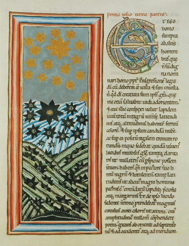
Hildegard von Bingen, Sibyl of the Rhine, was (it is assumed) a migraine sufferer.21) She wrote that her beautiful illuminated pages of concentric circles and toppling stars came from Godly visions visited upon her. I see something in her paintings of what I see behind my eyes when things get real bad. Even knowing these migrainous auras have a physiological origin, I don’t discount that they are just as holy as if they came from angels.
While the migraine took hold, suddenly I noticed my mouth had a metallic taste to it. That’s when I thought about dyeing, with an “e.” To be fair, in that state I thought about both. But to get a dye to bite into fabric, in order to colour cloth, it needs a mordant. For protein fibres such as wool and silk, you would use a metallic salt - alums, iron, copper, sodium, tin and tungstens. Our bodies and blood contain many of these things. A common practice of dyers would be to urinate into the dye vats to set the colour extra good - urea water is still a key ingredient in textile dyeing. These will keep your coloured fabrics from washing out, these are what “sets” colour into fabric. So what colours was my migraine trying to set in me last night.
Notes
2 “What is coal ash?” EPA government website www.epa.gov/coalash/coal-ash-basics
3 Shoichet, C. (2014). Spill spews tons of coal ash into North Carolina's Dan River - CNN. [online] CNN. Available at: edition.cnn.com/2014/02/09/us/north-carolina-coal-ash-spill/index.html [Accessed Feb. 20, 2022].
4 youtu.be/UsReDuI7cC8 Charleston, West Virginia man lights tap water on fire; water contamination crisis [Accessed March 18, 2022]
5 Harris, F. (1974). Burning Up People to Make Electricity. The Atlantic, [online] (July). Available at: www.theatlantic.com/magazine/archive/1974/07/burning-up-people-to-make-electricity/304563/ [Accessed 20 Feb. 2022].
6 Bednarik, R. (1997). The global evidence of early human symboling behaviour. Human Evolution, 12(3), pp.147-168.
7 Tributsch, H. (2016). Ochre Bathing of the Bearded Vulture: A Bio-Mimetic Model for Early Humans towards Smell Prevention and Health. Animals, [online] 6(1), p.7. Available at: https:// ncbi.nlm.nih.gov[Accessed 1 May 2019].
8 Wadley L, Williamson B, Lombard M. (2004). Ochre hafting in Middle Stone Age southern Africa: A practical role. Antiquity 78, pp.661–675.
9 Rifkin, R. (2012). Processing ochre in the Middle Stone Age: Testing the inference of prehistoric behaviours from actualistically derived experimental data. Journal of Anthropological Archaeology, 31(2), pp.174-195.
10 Taussig, M. (2009). What Color Is the Sacred?. Chicago: University of Chicago Press, pp.8.
11 Feeser, A., Goggin, M. and Tobin, B. (2012). The materiality of color. New York: Routledge, pp.47-48.
12 Feeser, A., Goggin, M. and Tobin, B. (2012). The materiality of color. New York: Routledge, pp.47-48.
13 Batchelor, D. (2000). Chromophobia. London: Reaktion.
14 Jay, M. (2018). Chromophilia. positions: asia critique, 26(1), pp.13-33.
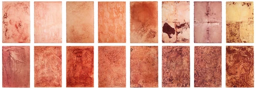
15 Mejía, Susana. Color Amazonia. Palo brasil pigment on paper. 102 x 68 cm
16 Pynchon, T. (2014). Gravity’s rainbow. New York: The Penguin Press.
17 2 Leslie, E. (2005). Synthetic worlds. London: Reaktion Books, pp.29
18 4 Lowengard, S. (2006). The Creation of Color in Eighteenth-Century Europe.
19 Leslie, E. (2005). Synthetic worlds. London: Reaktion Books, pp.127-142.
20 Albers, J. (1963). Interaction of color. New Haven: Yale Univ. Press.
21 www.americanscientist.org/article/a-perspective-on-the-migraine-mind